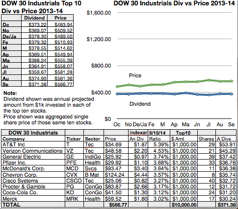
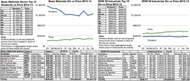
To help explain how dog stock trading worked I needed a charting technique that kept mathematics simple in the mind of the beholder. I chose to display annual dividends based on how many dollars would be generated in a year from a $1000 investment in each stock. I charted that number against the aggregate single share price of a block of ten stocks in any given index, sector, or random collection of stocks, Here’s a recent chart for the dow dogs:
Comparing the top ten dow dogs to the top ten of any subject index, sector, or collection gives a clear instant picture of the relative volatility and risk as displayed by the gaps between dividend and price. For the past year the Dow has shown itself to be overbought as the aggregate single share price has pulled further ahead of dividend from $10k invested as $1k in each dow dog.
Q: How do you catch a dog? A: Follow his tracks!
Charts of Price vs. Dividend let the catcher see the dog tracks.


